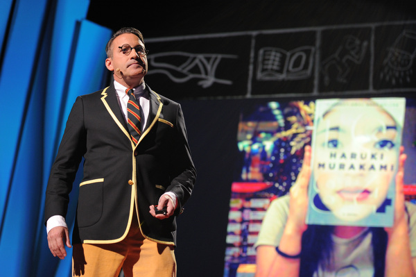
Photo: James Duncan Davidson
In Reid Hoffman, we’ve already welcomed the start-up whisperer. Now here’s the “book whisperer”, or, as Chip Kidd describes himself, he’s a “book designer, page turner, dog eared place holder, notes in the margins taker, ink sniffer.” And with a wiggle of his hips, Kidd’s off to tell us about devoting 25 years of his life to designing books, a decision that “started as a benign mistake, like penicillin.” He wanted to be a graphic designer, and he ended up with a job at Albert A. Knopf, where his job became to ask one question: What do the stories look like? And he proceeds to give us a whistlestop tour through some of the incredible titles he’s created over the years, with sharp snarky stories served as delightful side dishes. For instance:
Michael Crichton: Jurassic Park
“Someone is reengineering dinosaurs by extracting their DNA from prehistoric amber. Genius!” he says of the commission to design a book cover for Crichton’s dinosaur classic. Kidd headed off to the Museum of Natural History, where he bought a book, went home and was inspired by a large dinosaur skeleton illustration. “I started to reconstitute the dinosaur,” he says. “I had no idea what I was doing or where I was going but at some point I stopped. I ended up with a graphic representation of us seeing this animal coming into being. Then I threw some typography on it.” He shows us the result (applause) and then he shows us Michael Crichton’s faxed response: “Wow! Fucking Fantastic Jacket” (more applause.)
David Sedaris: Naked
The title essay in this collection is about Sedaris confronting his fear of his own body image by visiting a nudist colony. For Kidd, it was an excuse to design a book you could literally take the pants off of–the book itself has a picture of a skeleton, covered by a sheath pictured with a pair of underpants. Sedaris apparently loved it for being able to daub bawdy doodles over the skeleton at book signings.
Augusten Burroughs: Dry
This book was about the author confronting alcoholism, and so Kidd wanted to create a sense of “typography in denial: it’s lying, desperately, hopelessly, the way an alcoholic would.” He printed out some type on an Epson printer, taped it on a wall, and then threw a bucket of water on it. The printer put spot gloss on the dripping ink on the press and that, he said was that. Apparently, Burroughs himself watched a lady take a copy of the book to a cashier in a bookstore. “This one’s ruined!” The reply: “I know lady, they all came in that way.” You can tell this thrilled Kidd.
Osamu Tezuka: Buddha
“A book cover is a distillation, a haiku, if you will, of the story.” For this eight volume epic life of the Buddha, the story visually tells the tale, literally, on the shelf, via the books’ spines.
Orhan Pamuk: My Name Is Red
This one was a puzzle. And so Kidd deconstructed the story and placed it around the cover. The clandestine lovers are there on the spine; the sultan peeks out on one side of the cover; there they are getting found out. “Now we have to open [the book] to find out what will happen next. Try experiencing that on a kindle!” he adds, to great applause.
It’s not that he’s against e-books, he adds. They bring ease, convenience, portability — but something is lost without books. “Tradition, sensual experience, the comfort of ‘thinginess,’ a little bit of humanity.” And, he adds, “I am all for the iPad. But trust me, smelling it will get you nowhere.”
Haruki Murakami 1Q84
This 900-page book “is as weird as it is compelling. There’s a climactic scene where hordes of tiny people emerge from the mouth of a girl and cause a German shepherd to explode. It’s not exactly Jackie Collins.” Nonetheless, Kidd played with the idea of parallel planes of existence literally, with multiple covers overlapping and influencing each other. “The object itself invited exploration, interaction, consideration, and touch. And it paid off: it debuted at #2 on the New York Times bestseller list, unheard of for our publisher and for the author.”
“If we do our job right great art can be great business,” Kidd concludes, before picking up a copy of 1Q84 and adding that for him, “the story looks like this.” He brandishes the book and leaves the stage to great applause.

Comments (11)
Pingback: ‘Sun and Moon’ Cover Reveal – by Gabriele Golissa – Fine Art Photography
Pingback: Book Cover Art Ideas: 9 Insights from AI - Life Unchained
Pingback: Book Cover Art Ideas: 9 Insights from AI - Digital Author
Pingback: Book Cover Art Ideas: 9 Insights from AI - Wordmusings
Pingback: Book Cover Art Ideas: 9 Insights from AI - Make IT Richer
Pingback: Book Cover Art Ideas: 9 Insights from AI -
Pingback: Book Cover Art Ideas: 9 Insights from AI - Now Novel
Pingback: Chip Kidd: Book Designer Extraordinaire | book / art / love
Pingback: TED Ads Worth Spreading Curator 2012 |
Pingback: Inspiring TED talks about design | zeitgeist in design