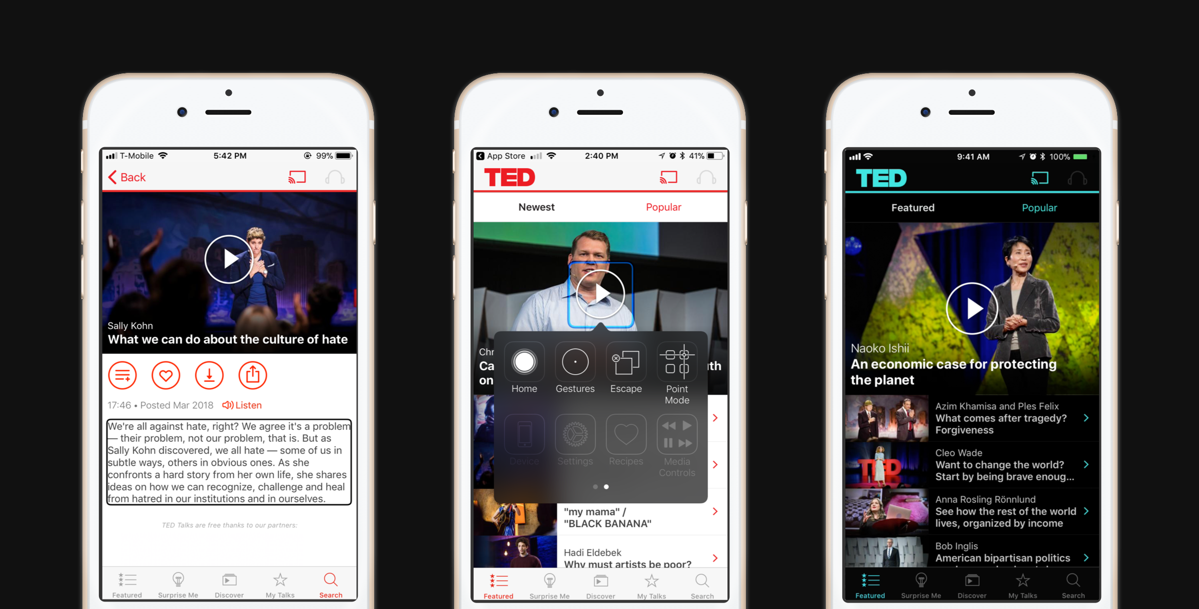
From left to right: the latest version of the TED iOS app, demonstrating VoiceOver, Switch Control and Smart Invert Colors.
In line with TED’s mission of spreading ideas, we strive to make our platforms accessible to all users. Designing for accessibility means ensuring that all users can interact with your product and your content — including users who have disabilities or difficulties using traditional interactions. This includes users who are blind, visually-impaired, hard of hearing or who have physical issues that may hinder touch interactions, among others.
One example that we’re especially proud of is the work we’ve done on the TED iOS app to support accessibility best practices. Here’s how we went about bringing our accessibility standards to a new level — and why this kind of work is a valuable exercise for anyone designing a mobile app.
Improving accessibility means removing barriers and friction to the user experience. In order to identify what needed our attention, an iOS developer on our team performed an internal accessibility audit, and we worked in collaboration with AppleVis, an online community for blind and low-vision users of Apple products. Fixes suggested by AppleVis community members included: labeling a previously unlabelled button that takes a user to their settings; getting rid of duplicate buttons, which were on the same screen and both labeled “Listen”; and making the custom controls used in our popular “Surprise Me” feature work with VoiceOver.
Our latest TED app (version 4.5) includes fixes to the issues identified by AppleVis as well as the incorporation of three new accessibility features: an optimized version of VoiceOver, Switch Control and Smart Invert Colors. VoiceOver allows users to navigate apps using auditory cues instead of relying on visual feedback. Switch Control enables users to navigate apps using buttons or switches rather than by touching the screen. And Smart Invert Colors allows users to reverse the palette of colors seen in an app’s UI while preserving the colors of content, such as photos and videos.
While we’ve made some great strides towards being accessible to all, there are still some issues to tackle. Soon we’ll be working to support Dynamic Type, where users who have selected a larger text size on their iOS device will see this text size reflected within the app.
iOS provides powerful support for accessibility, and there are ways to get feedback from real users. We hope that other app developers prioritize making apps accessible for all users — and that, by sharing our experience, we can raise awareness and demonstrate how a little effort can make a big impact.