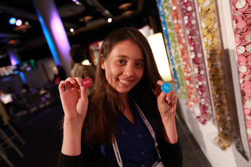
Nafissa holds her two favorite pins from the Physical Bar Chart. Photo: Robert Leslie / TED
One wall of the simulcast room at TEDGlobal 2011 is festooned with what appears to be a massive bar chart. Closer inspection reveals it’s a row of vertical plastic tubes, about 2 meters high, each dispensing buttons of a different color, and a message, such as “I was inspired and acted on it” (green), “I surprised myself” (blue) and “I said what I believe ” (red). We asked Lucy Kimball, the London-based designer and artist who created this “Physical Bar Chart,” to tell us all about the buttons and bars.
What’s this Physical Bar Chart for?
Physical Bar Charts are a participative installation that are extremely nondigital. This installation gives us real-time data about the ways the TED community is reflecting on what is going on at TED and how people are participating. People are invited to help themsleves to the badges — one or none, or as many as they like, and wear them. That way they make public in this community what they’re thinking about, what they’ve been experiencing at TED.
The texts on the buttons — “I stayed up too late last night,” or “I delayed judgement” — spark conversation. “Oh, you delayed judgement, too. Tell me about that.” It’s a way for people to connect in a nondigital way.
The tubes are also a technology for showing the results at the same time, so it’s real-time data gathering in a very nondigital way. If you stand from a distanace, you can see the current level in the tube and see clearly what the community are thinking about — a visual snapshot.
Why data as art?
I used to do a lot of digital art and became increasingly interested in data and the social reduction of data. I moved toward the idea of how the making, creating and sharing of data is very social process. This bar chart has been used in many public libraries, art galleries, universities, sometimes over months, in different types of communities, with different, appropriate texts, of course. Often they have to do with citizenship and political participation. So the charts are really a device for reflecting what a community is thinking about.
What made you move away from digital media?
I do digital media as well, but this is a reduction to absurdity. We now have the ability to digitally comment on everyone else’s comments, we all have vast amounts of data about ourselves, data we create, data we make public to others. Yet this is data: each one of these badges is a piece of data, so I’m playing with it as a kind of data artwork.
What’s more important to you, data or art?
Neither. I’m profundly interested in the processes of how we make sense of the world, how we engage with each other. Data and research are two of the ways. So this is unofficial research. It’s a playful, experiential kind of research.
Have there been any surprises?
People in the TED community have not been wearing the badges as much as I expected. In other communities, people wear them like medals, with immense pride, sometimes many at a time. Here, they find them funny, take them, put them in their pockets and don’t wear them. This is a community of innovators, who are used to the idea of disruption, yet they want to keep something a little bit private about what they’re thinking about TED. That has surprised me slightly.
What’s the least popular?
“My ideas were challenged.” That’s a surprise, too!
The most?
“I said what I believe.”
Comments