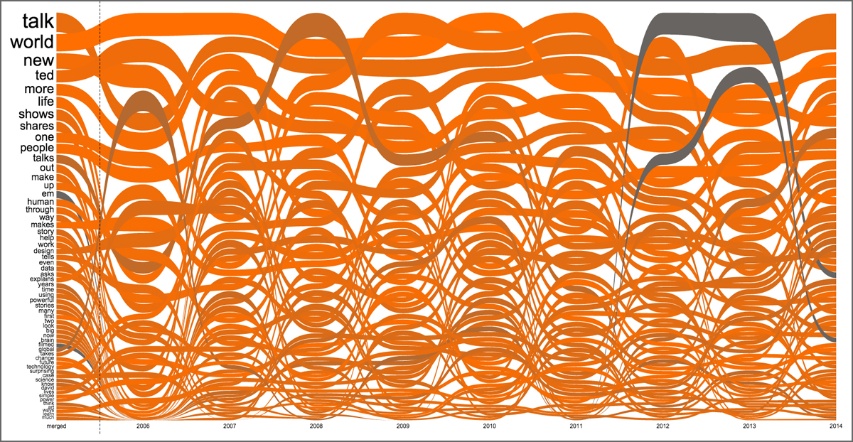
This interactive graph shows the most popular words in TED Talk descriptions over time. Click on the image to explore the visualization. Created by: Santiago Ortiz
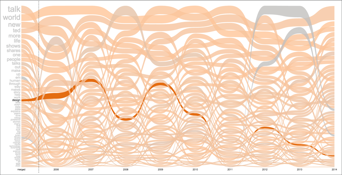
At first glance, the image above may look like an artistic tangle of worms. But it is actually a visualization of the words that appear most often in TED Talk descriptions. Each line corresponds to a word, and its snaking movement shows how its frequency of use has changed over time. Mouse over the word “work” and you can see that the line plateaus in 2007 and 2008, then stairsteps down from there. Meanwhile, the line for the word “brain” serpents its way to an all-time high this year.
This is one of the latest works from Santiago Ortiz, an information visualizer who lives in a small town in Argentina. On the website Moebio.com, he posts what he calls “experimental experiences with data” that run the gamut from Twitter conversations represented as stars in a galaxy to a brightly colored stream of the major players in The Iliad.“One of my specialties is networks of people who are connected by texts, by speech, by messages,” he says. “It’s a mixture of network analysis and text analysis. I studied mathematics — but before that, I studied music. I was always interested in using mathematics in creative ways.”
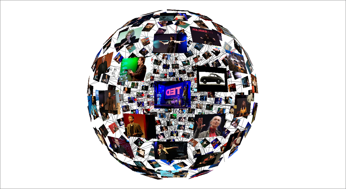
Ortiz has been visualizing TED Talks since 2007, when he was working for the Spanish data agency Bestiario and created “The TED Video Sphere.” This sphere organized all the talks available at the time into a globe, with a spiderweb of lines noting connections between talks. Click on a talk and it spins to the center of your screen, like a merry-go-round of ideas. Mouse over the lines, and you see information on how talks are related. You can view this sphere from the inside or from the inside — and you can zoom in to see the details or stay zoomed out to see the whole system.

Take the “TED Video Sphere” for a spin—literally— by clicking on the image. Created by: Santiago Ortiz, copyright Bestiario 2009
“At the beginning, I used to watch basically every TED Talk, but that became impossible,” he says. “So I thought about an explorative serendipity interface. I thought it would be interesting as a way to discover new talks.”
When it came time to choose a shape, the answer was obvious to him. “[A sphere] is a good metaphor,” he says. “A sphere is a good geometrical archetype for a community in which everyone is in the center, in a way. Connections are the core of this community.”
To create the sphere, Ortiz built a crawler to go to all pages of TED.com and gather data. As such, the sphere hasn’t been updated with talks published since it was created. “It’s a photograph of that moment,” he says.
Ortiz used a different method to create his newest visualization, which he calls “TED Word Flows.” He coded it using a spreadsheet we update daily with each new talk, so that it’ll always stay current.
“For this one, I took all the short summaries of talks and made an analysis,” explains Ortiz. “You can roll over a word and see how the word has been mentioned different amounts of times throughout the years.”
When he finished the initial coding for this project, Ortiz was surprised to see the lines that emerged. “You create very simple rules that connect the data with the graphical expression,” he says. “Sometimes you expect something linear and what you get is something exponential; sometimes you expect something exponential and it’s linear.” While he’d thought he’d see wild variations in every line — and to see new words pop into the graph each year — he saw remarkable consistency over time.
Of course, there are exceptions. And for the words in the flow that showed change over time, Ortiz had fun thinking about what might have happened. “The [words] can be a mirror, or the anti-mirror of reality,” he says. He points out the line for the word ‘global,’ which peaks in 2006 and then more or less disappears. “Maybe in the first year of TED.com, a lot of people used the word ‘global’ because that was the intention. But then TED went global and because it was so evident that it was global, the word just lost meaning. The drop of the word represents almost the opposite of reality.”
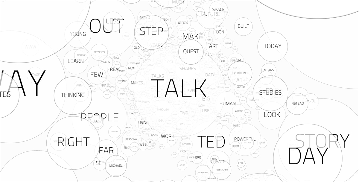
Before Word Flows, Ortiz visualized the most common words in TED Talk descriptions in a cloud form. “It’s beautiful as a three-dimensional object, but it’s not the best visualization because you have to navigate a lot to actually read it,” he says. “You get lost in the words.”
Ortiz says that he is far from done creating visualizations from TED Talk data. He says that he is already at work on a new piece—one quite vast in scale. The idea is to somehow show the talk descriptions as a heat map, noting hot words that connect to other talk descriptions. He envisions a new way to navigate through the TED library. “You will see the connected texts arrive and can click and then go and see the video,” he says. “With some collaboration, I could actually embed the videos in the visualization and make a big interface with all of the talks.”
Stay tuned. We’ll share new experiences from Ortiz on the TED Blog.
Fanfare shares art, music, video remixes and more created by TED fans around our content. Have something you’d like to share? Write kate@ted.com and tell her about it.


Comments (6)