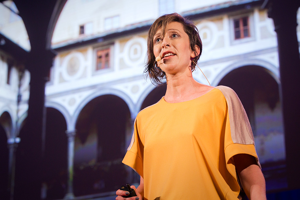
Alison Killing thinks a lot about death … and specifically, how its ubiquitous, hidden presence shapes our cities. In Death in Venice, her June 2014 exhibition on the topic, Killing mapped London’s death-associated architectural features — hospitals, cemeteries, crematoria, and so on — making visible the invisible mechanics of death and dying. She asks us to consider: What might a good death experience mean today? And how can we design differently for the dying, as well as those caring for them?
Here, the Netherlands-based British architect and urban designer, who specializes in humanitarian architecture, talks about how the project has challenged her own perception of death, and how she plans to make space for better dying.
First of all, it’s hard to miss the connection between your work and your name. Is it just a coincidence?
Yes, it’s my real name. My firm is called Killing Architects — I like to say that I started Killing Architects four years ago. [laughs]
How did you become involved in the architecture of death? Was it a long-term interest?
It began rather suddenly and recently with a call for proposals to the 2014 Venice Biennale. The theme was “fundamentals.” Most countries in the world stage their own exhibition in a national pavilion. For 2014, nations were asked to look at modernism in their own country between 1914 and 2014.
Two days before the deadline, a friend emailed me with an idea for the British Pavilion’s call for entries: “Let’s do an exhibition about death.” He and a partner had already completed a thesis project on this topic, and I pulled in a couple more friends to build a solid team with a curatorial and research base. We didn’t get accepted, but at the end of a quite rushed process, we had a proposal that was well worked out, and an idea that we liked. So we applied for funding on our own, and produced it in Venice as an independent event, coinciding with the opening week of the Biennale.
We had about 500 people come and see the actual exhibition, a few really nice reviews and quite a lot of press attention for the project, too. Part of the funding for the exhibition came from a Kickstarter campaign, and through that we had a lot of social media buzz. We could only stay open a week, but we heard of a lot of people going to Venice for the Biennale later on and looking for Death in Venice.
What was your focus for the exhibition?
When death has been studied before, it’s usually been from a memorial standpoint — about monuments and tombstones and so on — straightforward architecture. We had a lot of background research on this aspect, but we decided to think about how, while death is something that we don’t talk about much publicly, or even think about on a day-to-day level, it’s pervasive in our lives. Hospitals, hospices, crematoria and cemeteries surround us, yet we are not aware.
The architectural history of the 20th century is often presented in terms of advances in science and technology leading to light, airy, green, healthy cities for the masses. It was a reaction to the filthy industrial slums of the previous century. The narrative is about life and increased health and progress — but death is never mentioned in this story, even though these developments have also massively changed the way we approach it.
At the start of the 20th century, people typically died at home and of infectious diseases after a short period of illness (and a huge proportion died of “other causes” that couldn’t be adequately explained at the time). Developments in medicine — like the discovery of penicillin — and in public health led to a decline in deaths from infectious disease. At the same time, the invention of heavy and expensive medical equipment, like X-ray machines, needed to be kept somewhere central, which gave us the modern hospital. Universal health care meant more people got access to proper medical treatment, which in turn created a need for more of these buildings.

A close-up of one of the infographics in Death in Venice, showing changing life-expectancy over the course of the 20th century. Early in the century, many children died before their 5th birthday, and the average life expectancy at the time was around 48. Today we can expect to live to almost 80. Photo: A. Molenda
We now overwhelmingly die of degenerative diseases, with cancer and heart disease being the two biggest killers in the Western world. It means that people tend to have a long period of chronic illness at the end of their lives in which they will spend a significant amount of time in hospitals, hospices and care homes. These buildings are also widely regarded as being pretty awful places to be, not just because you tend to be there for a negative reason, but also because the buildings themselves tend to be horrible — lots of long corridors, no natural daylight, it’s difficult to find your way around. They’ve been designed around the bureaucratic needs of very large institutions and the technology that needs to be housed there.
The centerpiece of our exhibition was a big interactive map of London, showing all of the space that is given over to death in the city — essentially showing how death has shaped the city. We worked with a team of graphic and interactivity designers called LUST, who are based in the Hague, on this. They developed the graphic identity of the exhibition and built the interactive installations. We also wanted to show how the cultural approach to death had changed over the last century, as well as take a look at where it is now. The idea was to provoke conversation.
What would you say our cultural attitude to death is now?
Death’s just become very institutionalized and very medicalized. It’s not only about the places where we die, but the experience of death, as well. On a pragmatic level, very few people want to die in hospital — the data varies depending on the survey, but it’s usually in single digits. Yet 55% of people do end up dying in hospital.
On top of that, in the NHS in the UK, about 50% of the complaints on the NHS have to do with the care of a dying person. This says that not only do we not get what we hope for in terms of our death experience, but we are unhappy with what care does exist.
Why do you think there’s such a stark contrast between what we want and what exists?
Medicine is about curing people, which sets up a conflict. It brings up a tricky ethical issue about when, if ever, doctors should stop trying to cure individuals. And how may we allow people to die with dignity, without pain?
Once I started talking with hospice workers and hearing their perspectives, I began to understand death as this really special time. You only get to do it once, and it can be a very close time for the family, very intimate. It is possible to have quite positive experiences around death, although of course losing someone you love is sad. The hospital setting isn’t conducive to those sorts of experiences, because there’s a tension between curative and palliative medicine. There’s also an argument to be made that smaller institutions are better able to treat patients in a more holistic way, taking into consideration social and spiritual needs, as well as physical. Holistic needs are perhaps more difficult to meet in a very large institution.
Above: This interactive map of London, which shows how many buildings and public spaces in the city are given over to death, is the centerpiece of Death in Venice. The solid white shapes are hospitals, hospices, mortuaries, crematoria and cemeteries. As visitors wave their hands over the map, the names of the sites appear. Video: Alison Killing
What makes UK history stand out when it comes to architecture and death?
The UK’s interesting in a variety of ways. It was the first country to industrialize, which created a lot of changes in society. It’s a very secular country, and one of the first to adopt cremation. It has one of the highest rates of cremation in the world now.
It’s also the country where the modern hospice movement emerged. Palliative medicine was established by Cicely Saunders, in 1967, in South London. Before then, hospices did exist, but it was very nursing-based. They did care for people’s emotional and spiritual needs, but what was missing was the medical aspect. So a variety of factors led us to focus on the UK, but as it turned out, it was a very appropriate place to start the conversation.
In your interactive map of London, it appears that almost every other building that lights up is a death-related site. This seems like a lot. Why the density?
A lot of what’s on the map is cemeteries. By the 19th century, cemeteries were basically full in Central London, so there were many Acts of Parliament passed that allowed larger cemeteries to open on the outskirts of the city. These are not outskirts any more — places like Hampstead Heath, Kensal Green or the City Cemetery, way out east. Later on, that’s where crematoria were sited as well. So you have what I like to call the ring of fire in Zone 3, where all the crematoria are located.
The other thing that happened in the 19th century was the founding of the London Mortuary Company. Because all of the city’s graveyards were filled, the company bought land outside of the city near Woking in Surrey, where they built a huge cemetery, thinking it was a major investment opportunity. They thought they had an evergreen market, and would make massive amounts of money charging people for burial spots. They even built a special railway line that left London Waterloo to go to the cemetery.
But it didn’t work. There was mismanagement and problems in getting set up, by which time other cemeteries had been built closer to London. Also, people weren’t prepared to pay huge money for the burial plots. And they’re not very good investments because they have to be maintained long-term. They ended up selling part of the land to the UK’s Crematorium Society, who was this team of campaigning doctors who, for public health reasons, wanted more cremation. So they built London’s first crematorium on that land.
What have you learned about people’s attitudes towards death during the course of doing this project?
I guess the revelation that’s been most shocking to me is how pragmatic people can be around death — what they do with the body, funeral expenses, and so on. It turns out that people do choose cremation because it’s easier and cheaper than burying the dead.
I also learned how deeply embedded death is in our culture, yet how individuals don’t really have an outlet through which to air their experiences. The project seemed to provide an opening for people to pull out their very particular and intimate stories about their encounters with death.
Whenever I start talking to people about this work, they’ll say something like, “That’s really strange.” Then there’ll be a pause of about 30 seconds — and then they talk to me for hours, telling me all of their strange family histories and secrets, really intimate, moving stories about their uncle who was in a hospice, or what the last few days of their grandmother’s life were like. One guy even told me he’d lived next to a guy who turned out to be a serial killer. The police spent a couple of weeks digging up the entire garden next door and exhuming bodies.

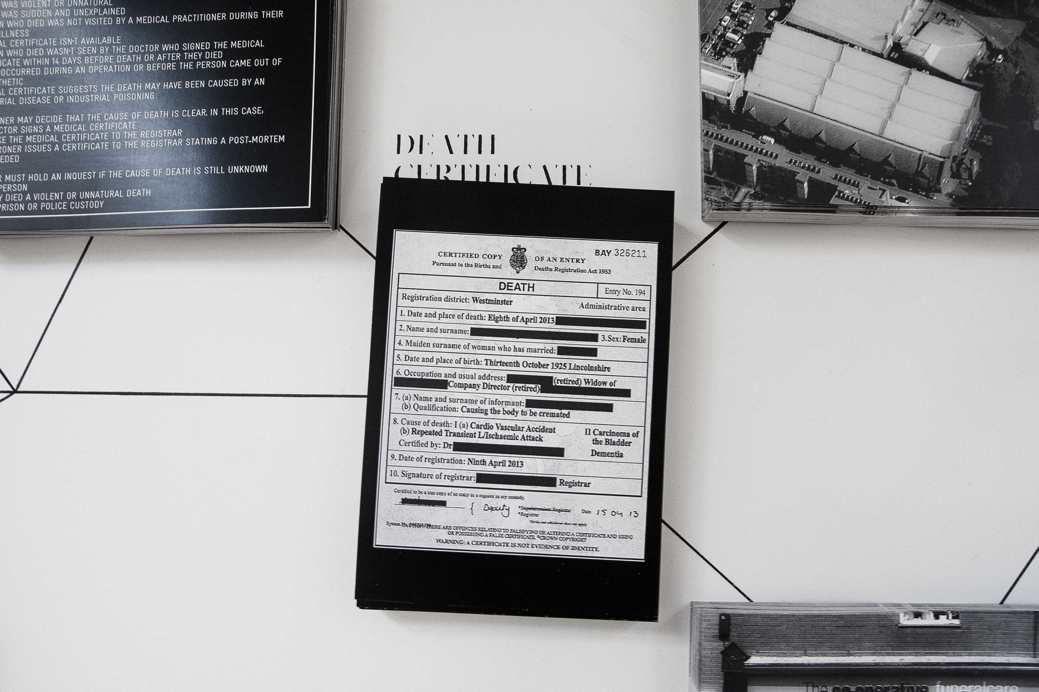
A selection of postcards showing the places that people pass through on either side of death. These cards, from 2014, include the coroner’s process checklist when a death is unexpected or suspicious. The postcard in the top right is of a mortuary in London, where bodies are stored before burial. A century ago, the body would instead be laid out in the family living room for people to visit and say their goodbyes. Photo: A. Molenda
Did the project change your personal perspective on death and space?
Actually, I had a big epiphany during the course of working on the exhibition. While talking with a colleague from Poland, I learned that there, tending the graves of one’s family is a big deal. There’s a national day of mourning every year where you go to the cemetery and light candles, plant flowers and tidy the grave.
Then she asked me, “What’s it like in the UK?” I realized my answer was: “Nothing.” It was only at that point that I realized neither of my grandmothers have a memorial stone. There’s nothing. They both got cremated at the crematorium in the west of Newcastle, and there are no memorials. I realized I didn’t even know where their ashes are. I’d never thought about it before.
Having delved into the subject, do you think you’ll take your architectural practice towards developing death-related buildings?
What I’d actually like to work on now is end-of-life care, because it seems to matter more what happens when the person’s still alive. I plan to research hospitals and health care institutions — do a fundamental study of how they work, and why, what goes right and what goes wrong. From there, I’d like to reconceive architecture associated with death to shelter that process. Looking at these buildings from the perspective of death also calls into question what these buildings are like more generally. They’re awful just to go to as a visitor, or for something minor and routine, so I’d like to look more widely at redesigning buildings for health care.
But it’s still early. We are still wrapping up Death in Venice, and are arranging our first few meetings with galleries and commissioning and funding bodies. While that’s happening, I’ll approach health care institutions to see who might commission such practice-based research.
It would also be interesting to work with hospices, institutions like Maggie’s Centres. This is an organization started by architecture critic Charles Jencks, whose wife Maggie suffered from cancer. They started the charity based on her experience of hospitals and cancer care, and now commission cancer care centers. These are essentially daycare centers, with no inpatients. Instead, they provide daytime support to patients, who can then remain at home. They might include counseling, dispensing medicines, or consultations with a doctor. They can also include social space. At Maggie’s Centres, the spaces are often centered around a kitchen table.

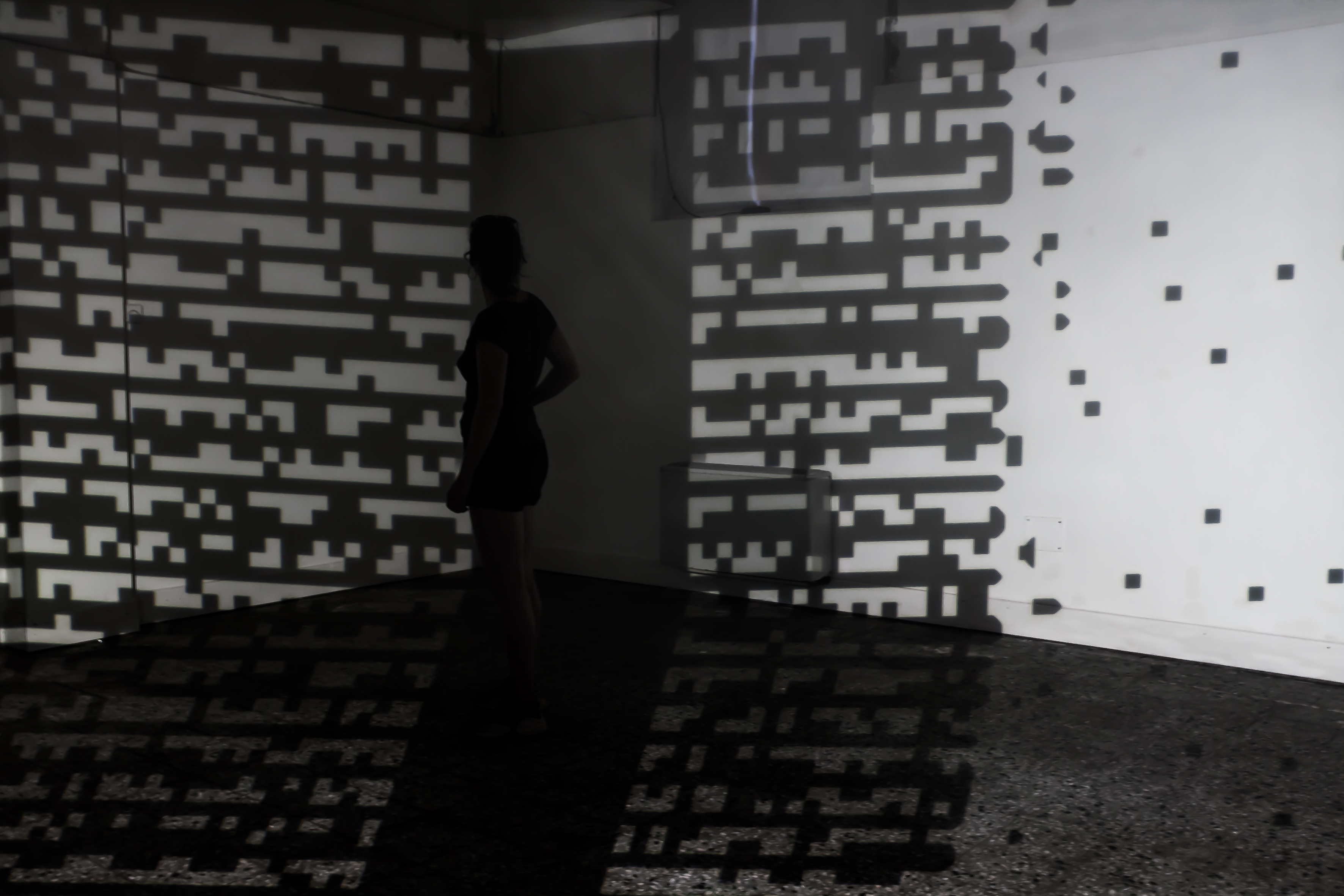
Interactive installation in Death in Venice: projection on smoke. The pattern being projected is based on changing life-expectancy data over the 20th century. The installation plays with the idea of the pervasive yet nearly invisible presence of death. The smoke makes the beams of light from the projector visible. Photo: A. Molenda
You’ve been thinking about death quite heavily in the last year. What else are you working on?
I have three projects running alongside each other at the moment. One is looking at how humanitarian agencies contribute to reconstructing cities after disaster, and helping them to work better in urban areas. This project came out of undergraduate work I did in refugee shelter, and a master’s degree I did in humanitarianism. I’ve been involved in that sort of world for about a decade.
I’ve also just finished a big study on vacant buildings in cities — specifically Rotterdam, Amsterdam, London, New York, Detroit, Stuttgart, Berlin and Tel Aviv — and how they can be used by arts and community groups. Almost every city has run-down areas with high numbers of empty shops and offices, and there are already awesome examples of projects like this around the world, but they often fail, primarily for financial reasons. I’m looking at possible financial and business models for such projects, doing interviews with the people carrying them out, but also turning the spreadsheets they use for their accounts into infographics. It’s useful to make that information visible, because then we can start to have proper conversations and develop better strategies. I’d now like to start developing that research into something practical, creating strategies for regenerating city neighborhoods with lots of empty buildings.
But I am still quite focused on Death in Venice, hoping to bring it to the UK as well as the Netherlands, in order to extend the dialogue around the subject. The exhibition explained where we are now and how we had come to this point, but it left a really obvious question unanswered: what should these buildings be like in the future? That’s where I would like my work to go next.

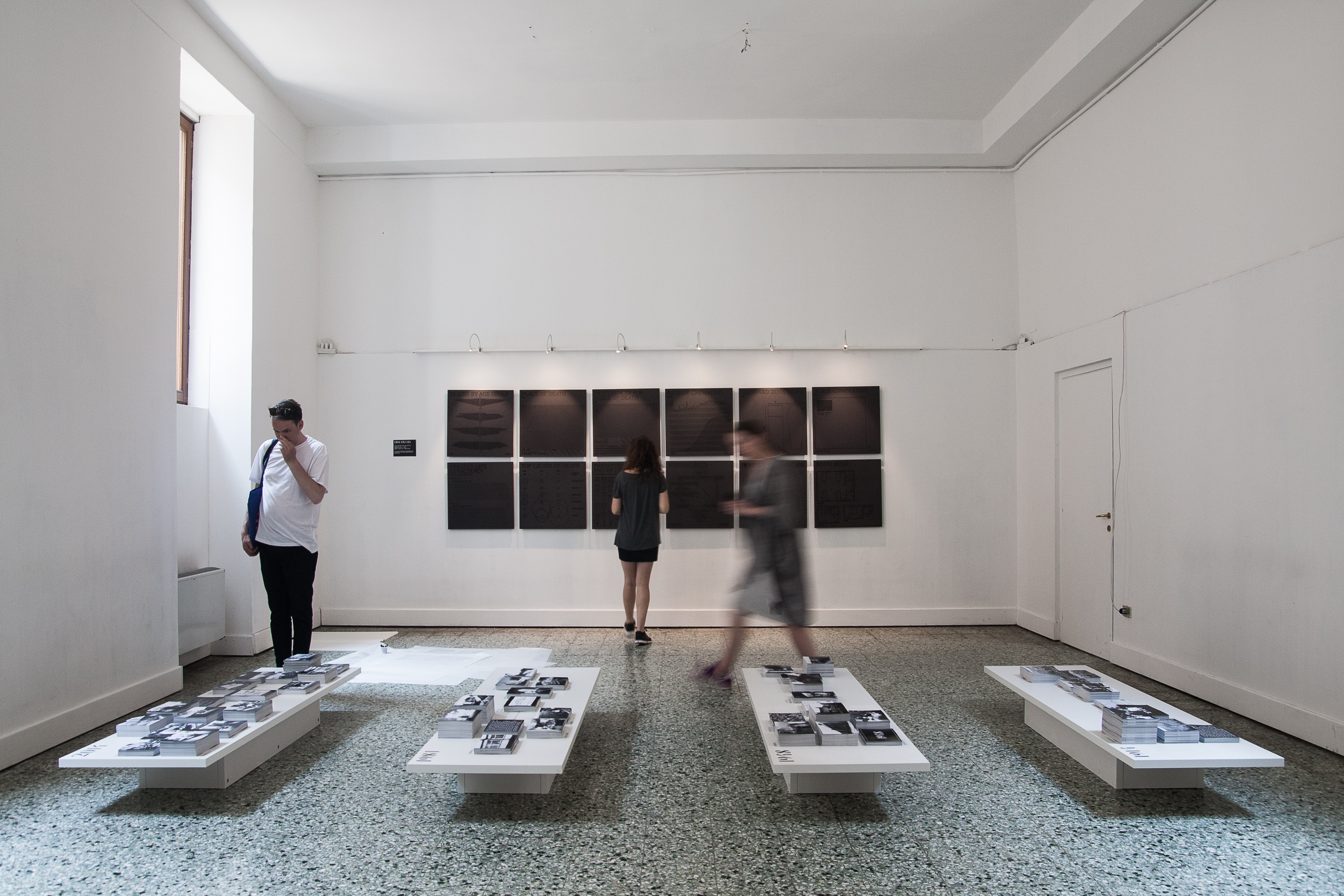
The final room in the Death in Venice exhibition. Panels on the back wall are infographics on death-related statistics, printed as reliefs so that visitors could make souvenir newsprint-and graphite-rubbings. Tables in the foreground hold postcards with information about death-related spaces, covering 1914, 1948, 1981 and 2014. Photo: A. Molenda
Death in Venice is the first exhibition of the wider ‘Death in the City’ project, a touring exhibition and research project looking at architecture related to death and dying and how these buildings could be better in future.
Credits for Death in Venice:
Curation and exhibition concept: Alison Killing, Stephen Kirk, Ania Molenda, George Wilson
Graphic design and interactive installations: LUST
Exhibition production support: Alessandro Borgomainerio, AB Venice
Research: Abigail Batchelor, Rachel Engler and Magnus Weightman
PR: Giulia Milza and Maria Azzurra Rossi, mintLIST
With thanks to Sabina Arbouw, Kuno Mayr, Daryl Mulvihill and Harald van der Sluys Veer.
The exhibition was funded by a grant from the Creative Industries Fund NL and with support from EGM Architecten, Printerpro and the Death in Venice Kickstarter campaign.
Comments (6)