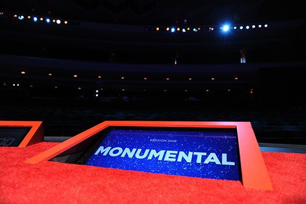
This is how speakers stay focused as they give TED Talks: a “confidence” monitor onstage, shown here at TED2011. Slide design: WORKSHOP/staff. Photograph: James Duncan Davidson.
It is, indeed, a monumental day here at TED Towers. We’re winners! Or, as June Cohen, executive producer of TED Media, described this morning’s news of our winning the 2013 National Design Award for corporate and institutional achievement: “We’re thrilled!”
“Design and design thinking has always been core to TED’s mission. After all, it’s the ‘D’ in TED,” she continued. “That’s reflected in everything we do, from staging and hosting our conferences, to filming and publishing our speakers’ talks, to building TED.com and our apps, to creating TED-Ed animations, to helping TEDx organizers put on independent events. We’re so grateful to the network of talented designers we partner with — as well as our in-house team — for their tireless efforts in moving TED’s mission forward.”
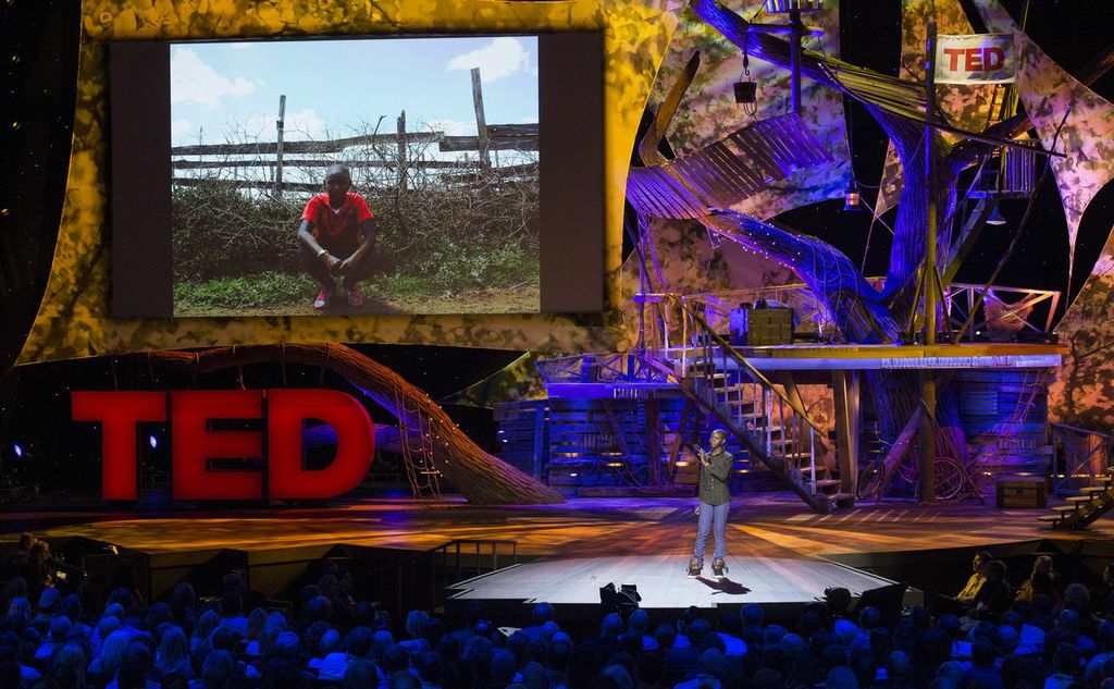
Stage design is a big part of the TED conference experience. Here, young African innovator Richard Turere tells his story at TED2013. Photograph: James Duncan Davidson.
The field of corporate design has evolved since its romantic heyday, when hero designers such as Paul Rand or Massimo Vignelli created iconic visual systems for companies such as IBM, UPS or American Airlines. These days, a company’s identity needs to be able to work in many different contexts, to adapt to the ever-changing needs and demands of a digitally driven universe even as it holds true to the principles at its core. This is especially true as TED’s list of initiatives is always growing.
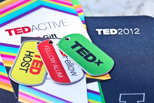
The TED branding works in many different contexts. Here, at right is a print program guide designed by Albertson Design, with TEDActive programs and dogtags designed by WORKSHOP.
Mike Femia, TED’s director of design services, explains how he and the team work across the company’s many extensions. The key? To focus on the mission statement of “ideas worth spreading.”
“We want a certain simplicity to be the basis of everything we do, so that TED can be a platform for ideas. We don’t want to overshadow them or impose unnecessary branding flourishes,” he said. “At the same time, we are very open to new design directions, and we work with many outside studios and designers who have unique viewpoints. The fundamental question: how can we use design to help encourage the spread of ideas? Our best work comes about when we bring all of these elements together.”
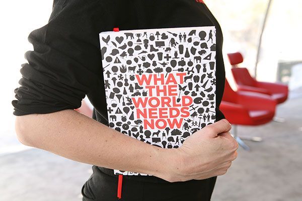
The theme of the conference is the basis of print pieces produced for attendees. Here, the cover of the program guide for TED2010, designed by Paper Plane Studio. Photograph: Marla Aufmuth.
Thaniya Keereepart, TED’s product development director, echoes the importance of remaining focused, a task that anyone who’s ever had anything to do with modern life knows is easier said than done. “Design should be simple. Quiet. It should bring to light the content and enhance the experience of content consumption,” she explained. “If you go to a website and the first thing you see is the design, that’s not TED.”
Both Keereepart and Femia are quick to share any credit for TED’s award with their many collaborators, both internal and external, and it’s safe to say we’re thrilled. Last word to the Cooper-Hewitt’s acting director, Caroline Baumann, who said this morning, “TED draws an enormous and varied audience who find inspiration and ideas from the conference, as do the speakers themselves. TED is an invaluable resource and experience for designers in all industries.”
Comments (4)
Pingback: 3 Tips for Using a Confidence Monitor – HB Live
Pingback: Foxy Elegant Themes WordPress Theme - Themophiles.comThemophiles.com
Pingback: MAGIC VIDEO HUB | David Kelley on the need for creative confidence
Pingback: David Kelley on the need for creative confidence | TokNok Multi Social Blogging Solutions