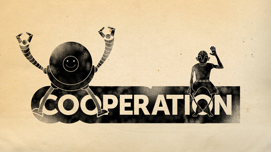
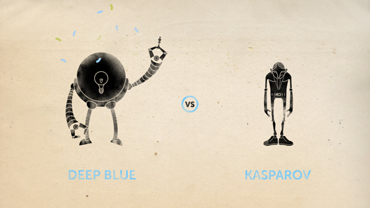
By now we’re all pretty familiar with the theory of presentations. Slides need to be bold, beautiful. They need to go easy on the amount of text they’re asking the audience to compute in a hurry. Speakers should speak to slides but not read slavishly from them. Still, sometimes a presentation comes along to show that, while we can all get pretty good at putting slides together, some people just elevate slide design to mastery. One such presentation was given at this year’s TEDGlobal conference by Shyam Sankar, a data intelligence agent at Palantir. The slides were different. They featured characters. They told a story in their own right. Something was going on here. So I collared Sankar and found that, indeed, something really was going on here.
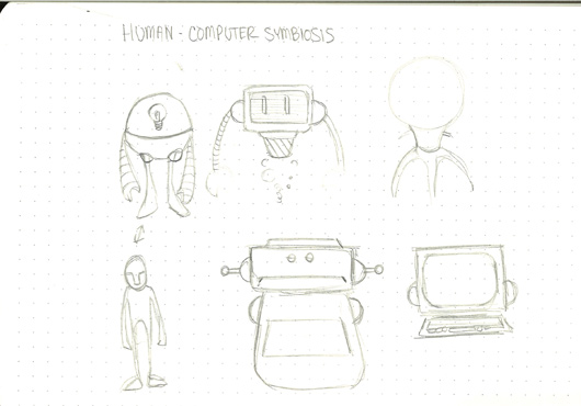
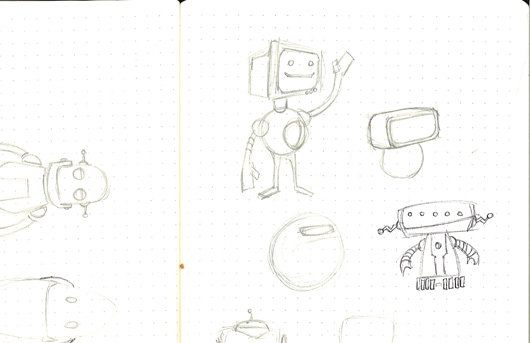
See, the slides were created by a former comic book designer who works on staff at the company. Why would they hire a comic book designer? Well, said Sankar, whose talk considered the idea of human-computer symbiosis: “We like those orthogonal things. We value nontraditional people.” I needed to find out more, so I called up this mythical comic book designer, one Collin Roe-Raymond, who’s actually now the lead graphic designer at Palantir. An edited version of our conversation follows, along with his sketches and some of the final slides shown in Sankar’s presentation:
I’m told you are a comic book artist. How on earth did you end up working at Palantir?
I started doing design classes at school, where I got really involved in the sequential art program. That’s a tricky way of saying comic books. After I graduated, I went back to New Jersey, where I’m from, and ended up doing freelance design for a bunch of different customers. But I heard great things about California, so I sold my stuff, bought a plane ticket, came to crash on a friend’s couch, and he introduced me to Palantir.
What did you think when you first went along to meet them?
These are some of the smartest people in the world. Their mission focus is to solve the world’s hardest problems. I was keen to do that.
Still, it’s hardly a traditional design company. Were you concerned about going in-house at a company?
You can’t be in the software industry trying to create these great things without a great sense of design. And we do put a lot of stock in design. We have two design teams and some of the best designers coming up. But the other cool thing is that they just look for talent. There’s an x-factor; you know when someone’s talented; you know you want them on your team. You might not know at the beginning what they’ll add, but if you find that x-factor you go for it.
So how did you go about designing this TEDTalk?
Shyam came to me to tell me he was giving a talk at TEDGlobal. We do a lot of presentations and slide decks, but obviously with a TEDTalk we’re not talking about the company, we’re talking about a concept. So first of all he came to me with the script and we sat down and broke it into sections. Then I put together really rough doodle sketches, cut them up to make transparent .png files out of them, and made a mock presentation in Keynote to show the animations. It was really rough but it showed the general idea.
What look were you going for?
I have always been fascinated by that whole cave painting thing where it’s kind of like the dawn of human intelligence, the handprint on the cave wall. This was about the new step in the evolution of human and computer symbiosis, so it seemed natural and made sense to have this textured paleolithic feel to it.
What about your two star characters?
The whole presentation really breaks down into those two characters: the humanoid and the computer. Figuring out what the computer should look like was tough. In some of my original sketches I had a computer screen. Then I saw the sketches and behind-the-scenes footage from The Incredibles, and so even though in that scenario it was a bad guy, the structure of the robot struck a chord. And that gave us the canvas to do some really fun things.
How long did it take you to put this together?
We did most of the work within about two weeks. Though I should add that every little piece of that presentation is hand-texturized. At some point in the middle of the process I did wonder if I was really going to go ahead and texturize every piece. Initially we had another, vector-based treatment. That would have been a lot easier.


Comments (4)
Pingback: Presenting at a Conference – garimajoshi.in
Pingback: Beautiful Math | moosehands
Pingback: Quora
Pingback: Thought You Should See This, July 6th, 2012 « Helen Walters: Writer, Editor