Designers solve problems and bring beauty to the world. At TEDNYC Design Lab, a night of talks at TED HQ in New York City hosted by design curator Chee Pearlman with content producer Cloe Shasha, six speakers pulled back the curtain to reveal the hard work and creative process behind great design. Speakers covered a range of topics, including the numbing monotony of modern cities (and how to break it), the power of a single image to tell a story and the challenge of building a sacred space in a secular age.
First up was Pulitzer-winning music and architecture critic Justin Davidson.
The touchable city. Shiny buildings are an invasive species, says Pulitzer-winning architecture critic Justin Davidson. In recent years, cities have become smooth, bright and reflective, as new downtowns sprout clusters of tall buildings that are almost always made of steel and glass. While glass can be beautiful (and easily transported, installed and replaced), the rejection of wood, sandstone, terra cotta, copper and marble as building materials has led to the simplification and impoverishment of the architecture in cities — as if we wanted to reduce all of the world’s cuisines to the blandness of airline food. “The need for shelter is bound up with the human desire for beauty,” Davidson says. “A city’s surfaces affect the way we live in it.” Buildings create the spaces around them; ravishing public places such as the Plaza Mayor in Salamanca, Spain, and the 17th-century Place des Vosges in Paris draw people in and make life look like an opera set, while glass towers push people away. Davidson warns of the dangers of this global trend: “When a city defaults to glass as it grows, it becomes a hall of mirrors: uneasy, disquiet and cold.” By offering a series of contemporary examples, Davidson call for “an urban architecture that honors the full range of urban experience.”
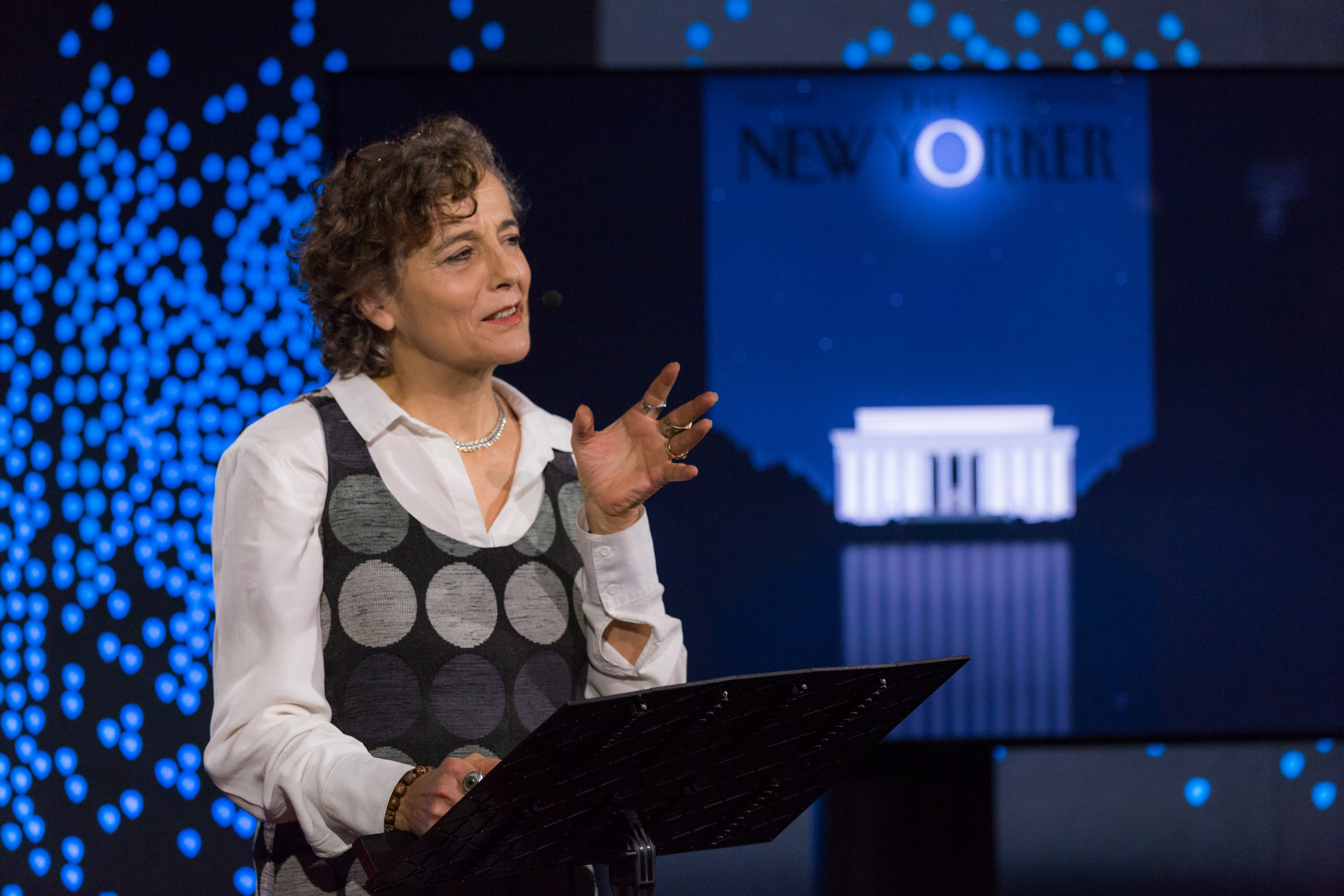
“The main thing we need right now is a good cartoon,” says Françoise Mouly. (Photo: Ryan Lash / TED)
The power of an image to capture a moment. The first cover of The New Yorker depicted a dandy looking at a butterfly through a monocle. Now referred to as “Eustace Tilley,” this iconic image was a tongue-in-cheek response to the stuffy aristocrats of the Jazz Age. When Françoise Mouly joined the magazine as art editor in 1993, she sought to restore the same spirit of humor to a magazine that had grown staid. In doing so, Mouly looked back into how The New Yorker covers reflected moments in history, finding that covers from the Great Depression revealed what made people laugh in times of hardship. For every anniversary edition of The New Yorker, a new version of the Eustace Tilley appears on the cover. This year, we see Vladimir Putin as the monocled Eustace Tilley peering at his butterfly, Donald Trump. For Mouly, “Free press is essential to our democracy. Artists can capture what is going on — with just ink and watercolor, they can capture and enter into a cultural dialogue, putting artists at the center of culture.”
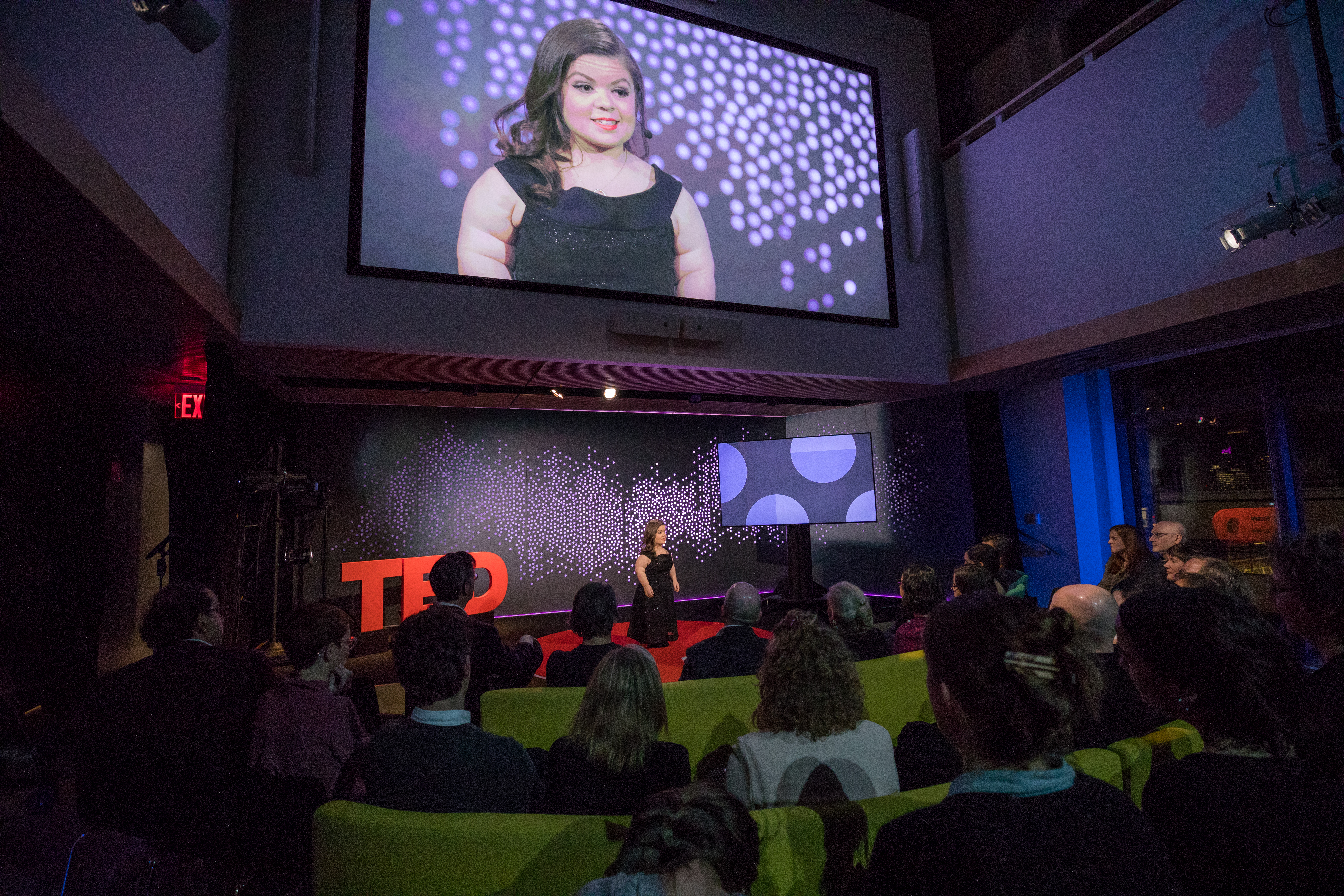
Sinéad Burke shared insights into a world that many designers don’t see, challenging the idea that design is only a tool to create function and beauty. “Design can inflict vulnerability on a group whose needs aren’t considered,” she says. (Photo: Ryan Lash / TED)
What is accessible design? “Design inhibits my independence and autonomy,” says educator and fashion blogger Sinéad Burke, who was born with achondroplasia (which translates as “without cartilage formation”) the most common form of dwarfism. At 105 centimeters (or 3 feet 5 inches) tall, Burke is acutely aware of details that are practically invisible to the rest of us — like the height of the lock in a bathroom stall or the range of available shoe sizes. So-called “accessible spaces” like bathrooms for people in wheelchairs are barely any better. In a stellar talk, Burke offers us a new perspective on the physical world we live in and asks us to consider the limits and biases of accessible design.
The beat of the Book Tree. Sofi Tukker brought the audience to their feet with hits “Hey Lion” and “Awoo,” featuring Betta Lemme. For the New York City–based duo, physical performance is a crucial element of their onstage presence, demonstrated through the use of a unique standing instrument they designed called the “Book Tree,” made from actual books attached to a sampler — with each percussion comes a beat. Their debut album, Soft Animals, was released in July 2016, and their single “Drinkee” was nominated for Best Dance Recording at the 2017 Grammys.
Finding ourselves in data. Giorgia Lupi was 13 when Silvio Berlusconi shocked many in Italy by becoming prime minister in 1994. Why was that election result so surprising, she wondered? This was the first time when the “data” she had gave her a distorted image of reality: the information available to her was simply too limited and imprecise, too skewed to give any real picture of what was going on. In America’s 2016 election, when we had many more data points and many felt the sample was representative enough, most data analysts still predicted the wrong outcome. Lupi, the co-founder of data firm Accurat, suggests that such events highlight larger problems behind data’s representation. When we focus on creating powerful headlines and simple messages, we often lose the point completely, forgetting that data alone cannot represent reality; that beneath these numbers, human stories transform the abstract and the uncountable into something that can be seen, felt and directly reconnected to our lives and to our behaviors. What we need, she says, is data humanism. “To make data [sets] faithfully representative of our human nature, and to make sure they won’t mislead us anymore, we need to start designing new ways to include empathy, imperfection and human qualities in how we collect, process, analyze and display them.”
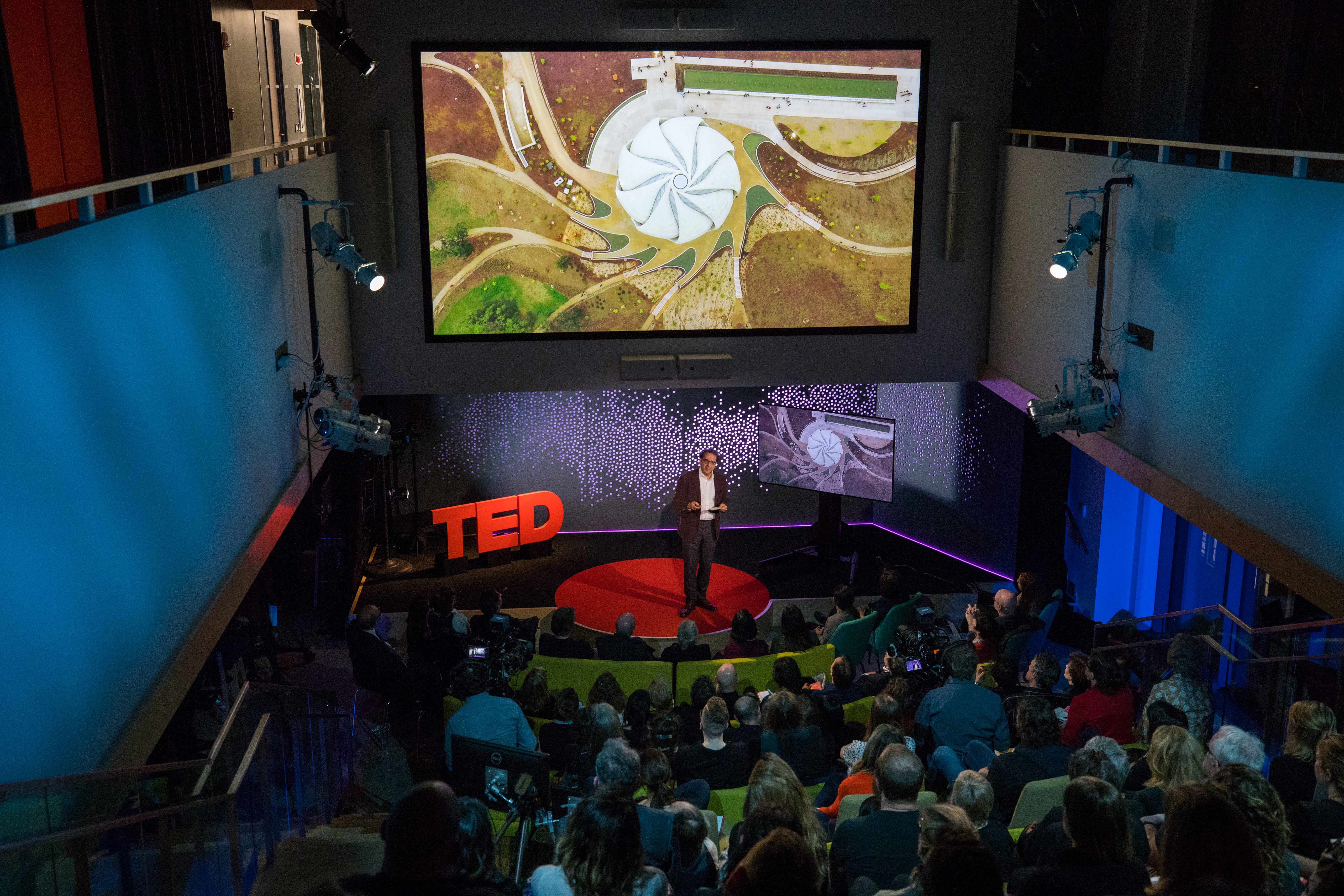
Siamak Hariri describes his project, the Bahá’í Temple of South America in Santiago: “A prayer answered, open in all directions, capturing the blue light of dawn, the tent-like white light of day, the gold light of the afternoon, and at night, the reversal … catching the light in all kinds of mysterious ways.” (Photo: Ryan Lash / TED)
Can you design a sacred experience? Starting in 2006, architect Siamak Hariri attempted to do just that when he began his work on the Bahá’í Temple of South America in Santiago, Chile. He describes how he designed for a feeling that is at once essential and ineffable by focusing on illumination and creating a structure that captures the movement of light across the day. Hariri journeys from the quarries of Portugal, where his team found the precious stone to line the inside of the building like the silk of a jacket, to the temple’s splendid opening ceremony for an architectural experience unlike any other.
In the final talk of the night, Michael Bierut told a story of consequences, both intended and unintended. (Photo: Ryan Lash / TED)
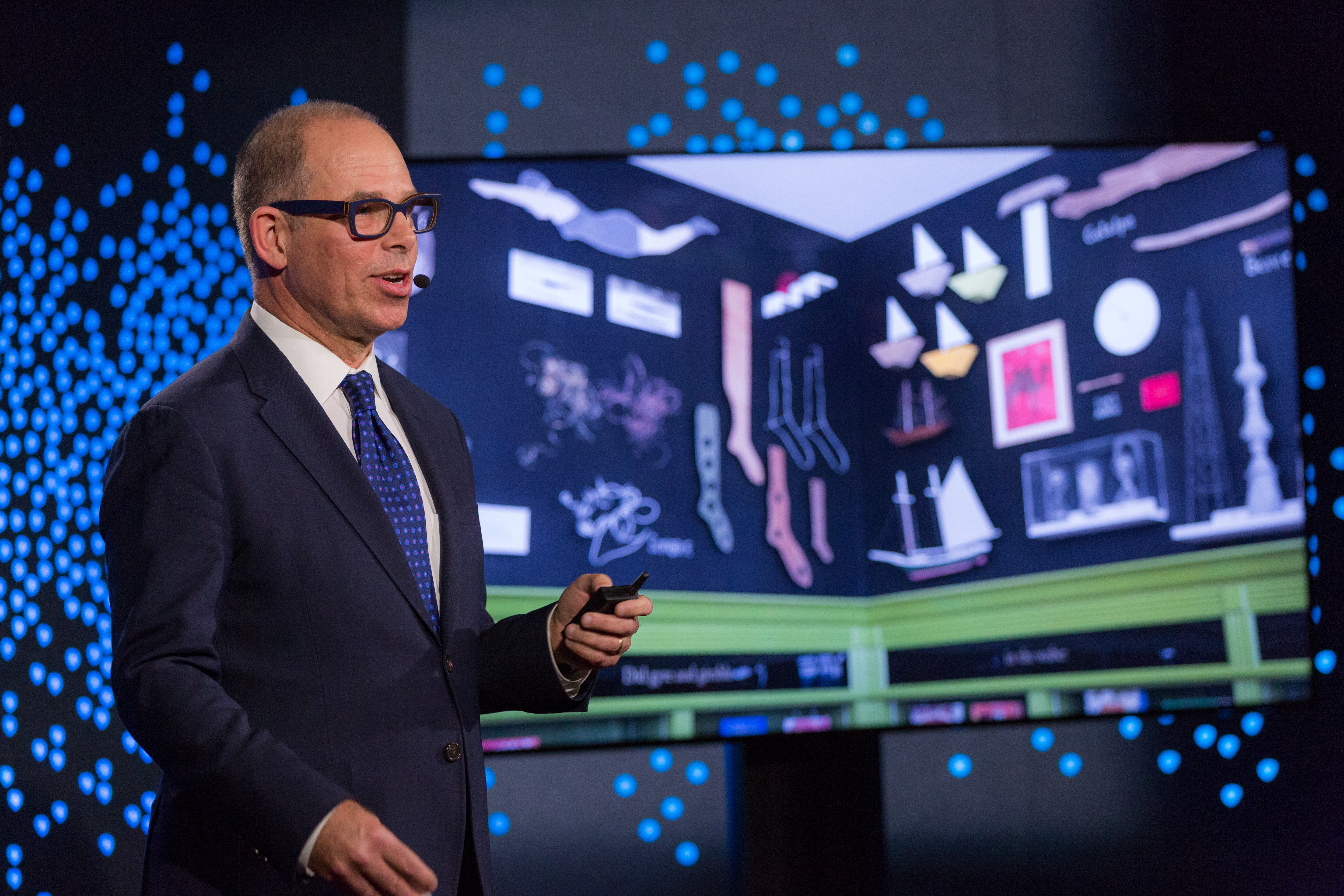
Unintended consequences are often the best consequences. A few years ago, designer Michael Bierut was tapped by the Robin Hood Foundation to design a logo for a project to improve libraries in New York City public schools. Beruit is a legendary designer and critic — recent projects include rebranding the MIT Media Lab, reimagining the Saks Fifth Avenue logo and creating the logo for Hillary Clinton’s presidential campaign. So after some iterating, he came upon a simple idea: replacing the “i” in “library” with an exclamation point: L!BRARY, or The L!BRARY Initiative. His work on the project wasn’t over. One of the architects working on the libraries came to Bierut with a problem: the space between the library shelves, which had to be low to be accessible for kids, and the ceilings, which are often very high in the older school buildings, were calling out for design attention. After tapping his wife, a photographer, to fill in this space with a mural of beautiful portraits of schoolchildren, other schools took notice and wanted art of their own. Bierut brought in other illustrators, painters and artists to fill in the spaces with one-of-a-kind murals and art installations. As the new libraries opened, Bierut had a chance to visit them and the librarians who worked there, where he discovered the unintended consequences of his work. Far from designing only a logo, Bierut’s involvement in this project snowballed into a quest to bring energy, learning, art and graphics into these school libraries, where librarians dedicate themselves to excite new generations of readers and thinkers.